You should know by now that almost everything can be optimized online to get better results. Be that changing a headline, editing the length of a copy or even altering the colors on your next Facebook ad.
With so many things to consider when choosing the right image, in this article I will show you 5 very cool image hacks to increase your click-through rate (CTR) on your next Facebook campaign.
1. Understand color psychology
A key factor to the success of your next Facebook ad is color. Colors have a huge psychological effect on the human brain and certain colors can trigger actions.
Here’s a great image created by KISSmetrics showing the psychology behind each color:
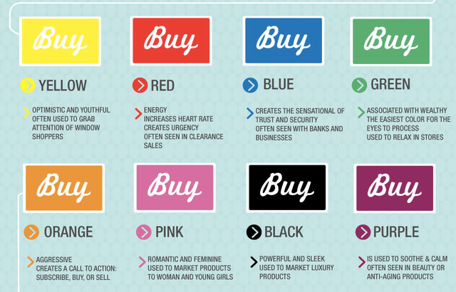
Your first step is to find the right colors that best fit in with your product and the message of your ad. For example, if you’re promoting a time-based offer, red images create a sense of urgency that compel prospects to click, while blue is ideal if you’re offering a professional service (think IBM and HP).
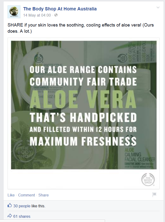
Here’s The Body Shop using green (associated with healing and energy) for one of their ads to promote a health product:
Pro-tip: Avoid using blue and white together, since these colors are used by Facebook your ads will not be as easy to see.
2. Eye-contact sells
Eye-contact is considered the most important variable in nonverbal communication, even in online material material according to Nancy Andreasen. Eye-contact is said to display trust, a sense of openness and be welcoming.
Since Facebook ads are a nonverbal form of communication, if you’re using a person in your next ad, where are they looking?
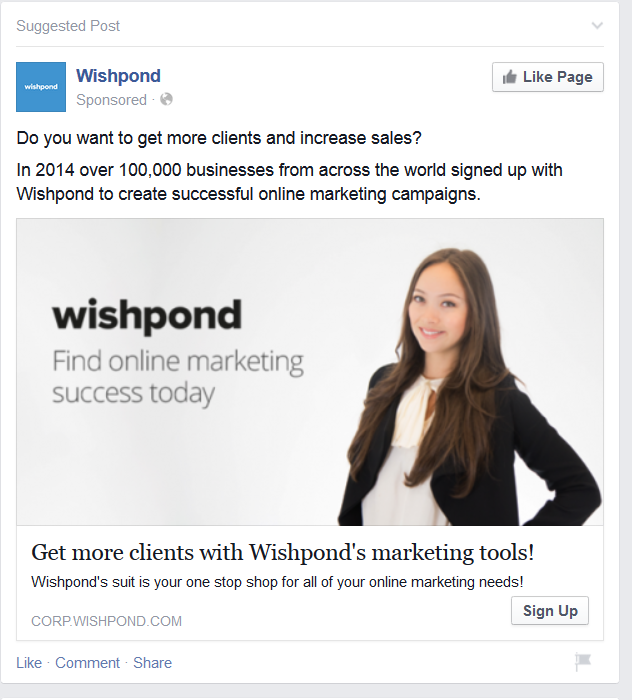
Here’s a current Wishpond ad that uses eye-contact to draw prospects in:
Pro-tip: When offering a solution or portraying a positive message, it’s been proven that smiles convert better.
3. Finding the right model or everyday Joe
It’s no surprise that the more attractive the person is in the image, the more clicks it will receive. But this isn’t true for all industries. In areas such as fashion and fitness, the main marketing message is to sell some kind of idea. Be this having a beach body in 12 weeks or looking glamorous in the latest dress.
To best reach these goals, using models who portray that ‘idea’ will drive CTR as it shows the prospect what is possible.
To give you an example, check out this Facebook ad by Lazada, a popular ecommerce site in Asia:
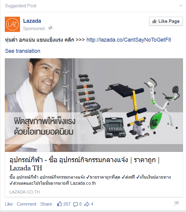
They are selling gym equipment and have used the picture of a well groomed man in their ad to sell the idea of what prospects can achieve should they buy.
However, if you’re offering a personal service or selling in the B2B industry, using regular people (like the Wishpond example above) is going to resonate with businesses better. Think about it, decision makers in the B2B industry don’t deal with models, they deal with everyday people.
4. Picking the right sex
Even something as simple as having a man or women in your Facebook image is going to affect the CTR of each ad. Generally speaking, you should use females when you want to portray the message of respect, connection or a sense of togetherness. These are best combined with the colors orange, green and purple, which represent warmth, nurturing and femininity.
Men should be used when you want to portray wealth, strength, power and affirmation. Colors to match these goals are red, black and blue which show masculinity and a sense of sophistication and professionals.
These are generalizations and should be adjusted to fit in with your brand and ad message.
5. Test more than one design
If you’ve ever played around with Facebook Ads Manager, you will have experienced some ads receiving lots of targeted engagement while others crash and burn. For each advertising campaign you plan to launch, you should aim to use at least two images that are very different from one another to see which yields the best engagement.
Here’s a split test Ad Espresso did for one of their own campaigns:
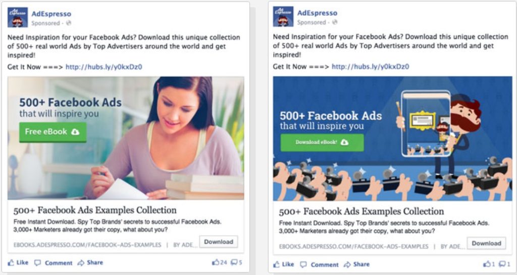
The image on the left yielded a cost per download of $1.68 while the image on the right was over $3.10! You can create really cool images that you think will convert, but unless you test you will never know how much money you could be saving (or losing).
Summary
The Facebook newsfeed is a busy place, not a minute goes by without somebody uploading a status or sharing a photo. In such a crowded environment, you need to use to every psychological hack you can find to really drive your CTR while keeping ad spend to a minimum.
Before you apply any of these 5 methods, you need to identity the message behind your ad. Are you looking to drive sales? Create brand awareness? Promote fear or positivity? Understanding the message you want to enforce and how your prospects want to be addressed, this will help lay the foundation to using the right images.