Did you know that on August 19, 2019 Facebook changed the way ads appeared in the mobile news feed?
In this article I’ll talk about the new updates that Facebook made to its mobile news feed and how marketers can adjust.
Advertisers are getting less space
Facebook updated the design of its platform for mobile earlier this year. If you haven’t noticed the change in design, update your app at your relevant app store.
With the new design, Facebook has made changes to the way ads are shown so they will match the look and feel of the new design.
The biggest changes that Facebook has made to page posts and ads on mobile are as follows:
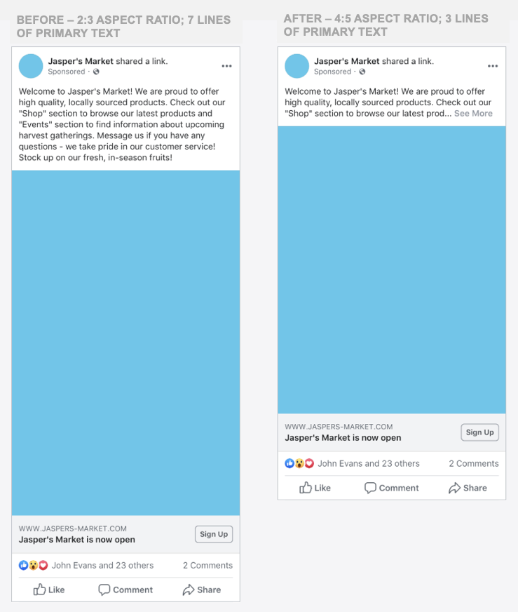
Less visible text – Before, you could show up to seven lines of visible text in a page post or ad. In the new update, Facebook will only show three lines of visible text and give users the option to view the additional text if they click on the ‘See More’ prompt.
Smaller images – Facebook has reduced the size of images from a 2:3 aspect ratio to a 4:5 aspect ratio, giving us a little less space on the news feed.
Here’s a photo from Facebook that shows us what the changes look like:

Facebook went on to say that these changes will increase ad effectiveness and make it easier for us to use the same assets on the desktop news feed and Instagram.
How to adjust
The first thing I would advise you do is go over your ads and review all campaigns that go over three lines of text and images that use a 2:3 aspect ratio.
Ask yourself if the first three lines of your ad are compelling enough to stop your audience in their tracks and click the ‘See More’ button.
You may want to make some adjustments in this area as your copy may not have the same impact now that you have less text space.
The same applies to your images. See how they look in the 2:3 formats and consider replacing them if they don’t have the impact they once did.
These changes were meant to take place on August 19, 2019, but after updating my Facebook app I still see full-length ads.
 If 2:3 images were a big part of your creatives and the new format isn’t working well, you may want to test other placements like Instant Experience or carousel ad formats.
Facebook is also introducing new placements such as search, and I encourage you to test them if you’re seeing a decline in results.
This change only impacts ads and pages
This new update only impacts page posts and ads on Facebook.
Marketers may see this as a major drawback, but putting the user experience above ads is good for the ecosystem in the long term as it will draw more people to the platform and make them stay there longer.
Facebook is having a tough time getting millennials on the platform. One reason for this is that it shows too many ads and content for pages.
These changes are healthy for the long-term vision of Facebook and they give us marketers a reason to write better ad copy and come up with better creatives.
Your turn
Do an audit of your creatives on Facebook and make the necessary changes. You may find that this new update does very little and it’s business as usual, but if after August 19th you’ve experienced a drop in conversion or clicks, go and audit your ads.